Evaluation
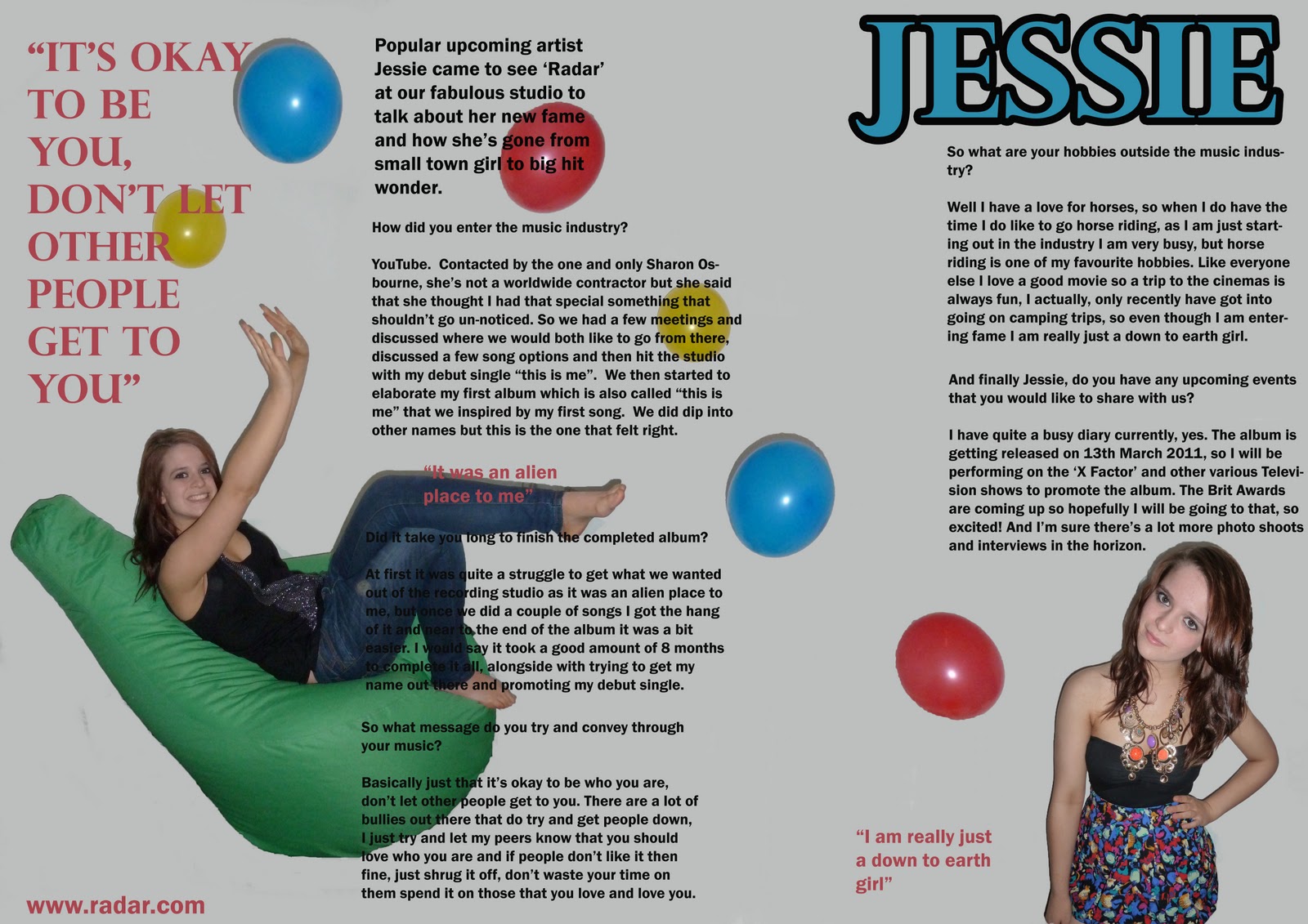
For our brief we started off with a preliminary exercise which was by using desk top publisher and an image manipulation program, produce the front page of a new school/college magazine, featuring a photograph of a student in medium close close-up plus some appropriately laid-out text and a masthead. Additionally we had to produce a mock-up of the layout of the contents page to demonstrate our grasp of desk top publisher. After this our actually main task was to produce the front page, contents and double page spread of a new music magazine. All the images and text used must be original, produced by us-minimum of four images. The main task was harder than the preliminary task, however after producing a front page of the school/college magazine it helped out a lot as we had an idea of what to do. Although I knew some magazine conventions from my previous research on the preliminary task, music magazine conventions are a little different so I decided to expand on my research so that I had a better understanding of each one. I looked at a few different magazines for example; NME, Billboard and Q. I choose these as they cover different genres and gave me an idea of what the difference is between magazines of different genres. After researching the conventions and meanings for a music magazine and after looking at other magazines I came to the conclusion that all music magazines use mastheads, cover lines, images, captions, the word ‘contents’, page numbers, headline and pull quote from the article. I analysed 3 front covers, contents and double page spreads from NME, Q and Billboard, that way I knew exactly what needed to be featured on my magazine front cover, contents and double page spread. To help with the setting out of my magazine I made mock ups on the computer and posted them on my blogger account.
After my research I decided that the target audience for my magazine would be for teenagers/students between the age ranges of 15-20. I came to this conclusion because the genre of my music magazine is r’n’b. My magazine would have to have a strong image on the front so that it would attract consumer’s eyes. I decided to change my magazine name from ‘MUSINE’ to ‘RADAR’ and the slogan for ‘RADAR’ is ‘detecting the nation’s new music’, I believe this slogan works well with the magazine and my target audience as I would be able to then feature new and up-coming artists which would attract my target audience as it may be seen as gossip and they will think they are the first to know about this artist and then inform their friends. I also thought that the age ranges of 15-20 would be good as they are the lowest class and therefore don’t have a lot of money so I think that they would be willing to pay the price I decided on for my magazine which is £2.00. As there is a win option for a meet and greet with Bruno Mars, my target audience might see the magazine as a cheap ticket to meet the singer as they would only be paying the small price of £2.00 rather than £30 and above.
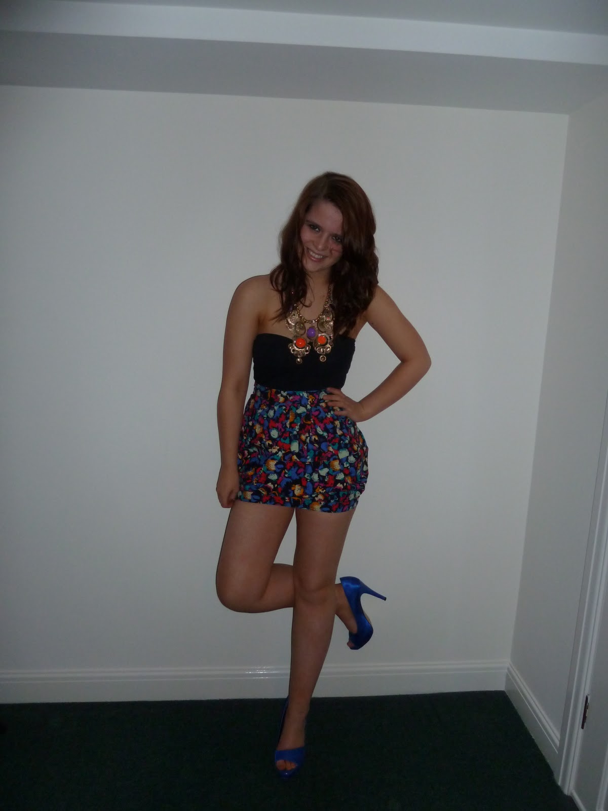
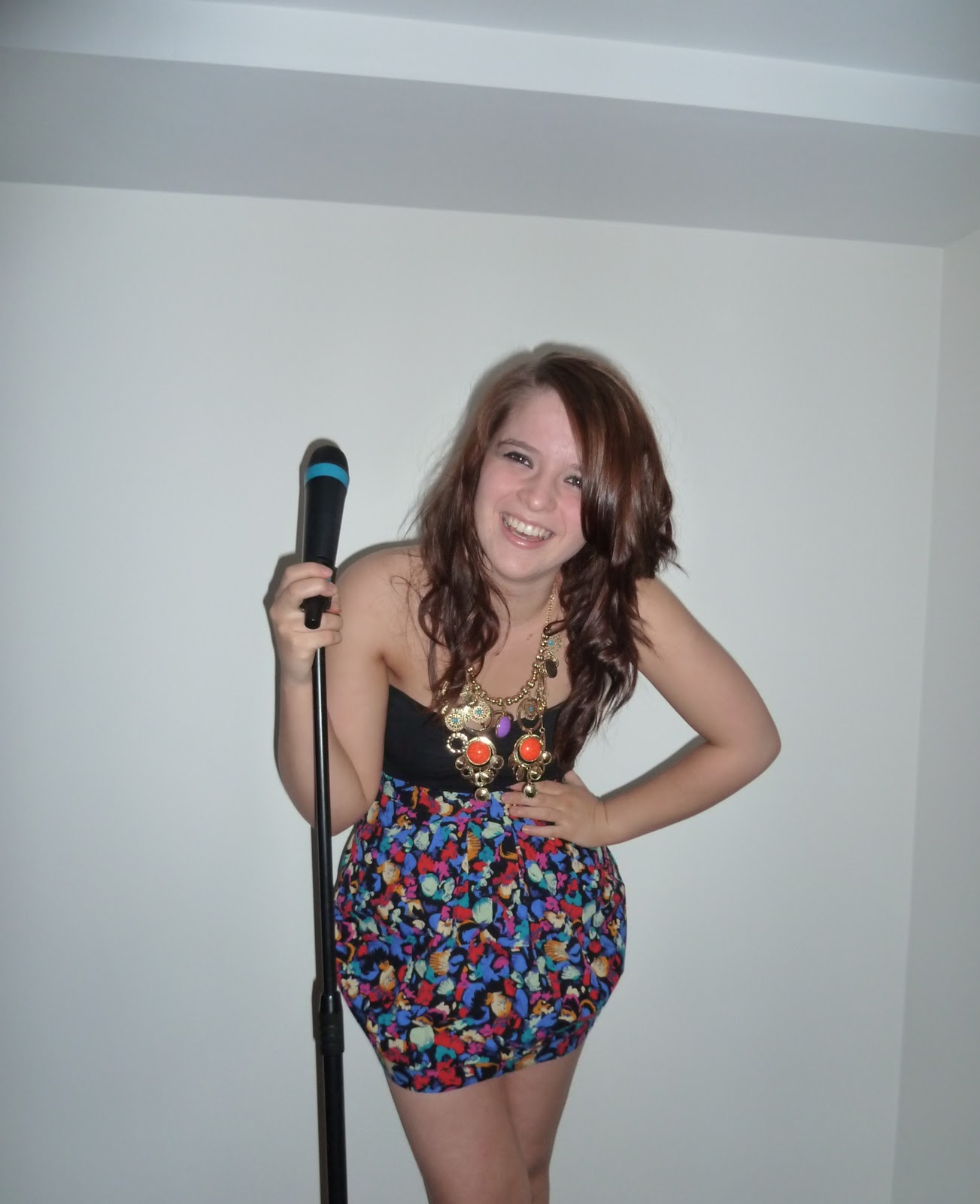 The main images I used are of a female, dressed in bright colours which will attract the consumer’s eye, she is smiling and therefore will portray to the audience that she is happy and friendly which will work well with my audience as then they will want to get to know more about her, she is also stood with a microphone stand and microphone which is a good ideology for the magazine so that readers know straight away its to do with music. I took a lot of photos for my magazine in my room and said it was the magazine’s studio in the magazine article, I got my friend to wear a few different outfits and stand in different positions such as, skirts, studded waistcoat and heels, we also took a few shots where she was stood facing the camera within medium close ups, ones where she was stood with the microphone stand, microphone and then finally when she was sat on a bright green bag playing with balloons to show her fun side. I did this so then that way I had a lot more variety to choose what images worked best and would be most suitable for my magazine. The final image I choose for my front cover was a medium full shot, she is leaning forward, smiling and looking into the camera and holding onto the microphone stand.
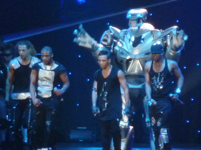
I used a full body shot for my contents page where she has one leg raised and she is holding a microphone behind her shoulder which is in line with her raised leg and is looking into the camera, I also used an image of JLS from their concert that I went to.


 Finally for my double page sp
 read I an image where she was sat on the beanbag playing with the balloons on one side of the page, and on the other side I used a medium shot. I copied the balloons and pasted them across both pages so that it linked the two pages together nicely.
My music magazine uses develop/challenge forms and conventions of real media products as I used;
· Masthead
· Slogan
· Cover lines
· Pictures
· Captions
· Pull quotes
· Barcode
· Date
· Price
· Issue number
· The word ‘contents’
· Website
· Features and reviews
· Page numbers and what’s on them
· Headline
All these conventions helped make my magazine come together and look like a professional magazine, this and colours I used for my text which were the same colours as the blue colour on the microphone on the front page and the pink/red on the skirt that my model is wearing. I had three main colours that I used throughout my magazine which were blue, pink/red and black; I also had three types of font styles that I used throughout the magazine which helped keep the house style of my magazine. The images used work well within the magazine, there are two images where she is with a microphone which shows I dedication and reassures the reader that it is a music magazine, and the others are of her having fun, especially the one where she is playing with the balloons. Real distributed magazines use all the conventions in order to sell, so if my magazine was a distributed magazine and for it to sell I would also have to use the conventions. As well as my image being strong, the masthead of my magazine needed to be strong as well therefore I named it ‘RADAR’ I choose this as the slogan I thought of went well with it which is ‘detecting the nation’s new music’, which I thought was quite catchy and I thought it would have a good effect with my target audience.
 During the time we had to research and analyse the music magazines I looked at some that would be like mine. After my final product I looked again at ones that look similar and I came to the conclusion that the kind of media institution that would distribute my magazine would be the magazine ‘VIBE’ as it used the same kind of style. It covers the same genre of r’n’b, and I also noticed that it matches the colour of text to the colour that the artist on the cover is wearing; the particular magazine I looked at had Kanye West on the front and he is wearing a grey jumper with a blue collar, the magazine have made the masthead and text around him that colour and have used the contrasting colour of pink as another coloured piece of text like I have on my magazine.
The magazine also has a pull quote on the front from Kanye West saying ‘I am rap’ like on mine I also have a pull quote form my featured artist.
From producing the magazine I learnt a lot about technologies that I didn’t really know about before hand. One of the technologies that I knew nothing about before using it for media to create the magazines is Photoshop. I leant the basics of create the correct side paper and then from there I learnt how to do most stuff on Photoshop, but the main ones that I used are;
- Layers
- Fonts
- Air brush
- How to insert an image
- The quick selection tool to cut round an object
- How to get the colour of a piece of clothing the same colour as text (by typing the text then going on to select a colour then pressing ALT and clicking on the colour of clothing)
- Text back
- Transform-scale
- Stroke
Other technologies I learnt about by creating magazines is how to use blogger, and how to keep it updated with my work so that my teacher could see my progress. Another thing is that although I knew how to work a camera before my skills of using the camera were very limited and so I learnt a few more things about how to get a good image for my magazine, by researching other magazines and how they take their images, the angles, the shots and lighting.
Looking back at the preliminary task and during the progression from that and up to the full product I feel that I’ve learnt quite a lot. Looking at my college magazine images and my images for my music magazine you can notice the big difference between the quality. I planned what my model is going to look like, from the hair through to the shoes. The lighting on my images is also much better and it looks more like a professional image than when it did when I took images for my college magazine. Since the preliminary task I have a better understanding of the conventions for a magazine, I know that it is important for a magazine to have them in order for it to sell, even if it is only something like having two pictures on a contents page rather than having about 5, it still makes a big difference and will affect the selling of that magazine. I especially know a lot more about Photoshop since then as before my peers had to help me with the majority of it and now I know how to do the most common stuff you use like, layers, quick selection, matching colours and airbrushing.