Friday 22 October 2010

Final Copy of College Magazine- 'Lock Down'

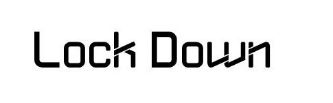
In the brief it asks us to create a front cover page for a college magazine and a draft of a contents page. I decided to call my college magazine 'Lock Down'. I wanted the name of my college magazine to appeal to my target audience which is students aged 16-18.  I choose tis name as it gives a sense of gossip which attracts the attention of my target audience. The colour of the masthead is a bright purple colour. The colour purple as I have previously mentioned gives connotations of ambition, wisdom, independence and creativity and success, which are the connotations i want for my college magazine and i think that the colour works well with a college magazine. As well as using the colour purple i have used blue and green too. Blue symbolizes trust, loyalty, wisdom, confidence, intelligence, faith and truth. Green has strong emotional correspondence with safetyThese colours all should attract the attention of my target audience and as surveys show that up to 75% of teenagers prefer the colour purple to any other it should relate to my target audience. The font that i waned to use for my masthead was going to be  as i thought it would relate well to my target audience, however when it came to the actual creation of my front cover it wasn't possible as the software i was using to make this didn't allow to use this font. I previously got it off the website http://www.dafont.com/ but due to the white background of the text it wasn't do-able. Therfore i used 'Ariel', i thought that by placing  the word 'Lock' on the left hand side of the side and the word 'Down' on the right hand side of the student, the magazine would be original and new which would also appeal to my target audience as they want the newest thing out. By positioning each word of the masthead at either side of the studnets head it would draw your attention straight to the student which what a college is about and may imply that the college puts their studnets first.

 The main image I used is of a student dressed in smart, casual clothes. She is holding her handbag which looks full which implies that the college and studnets are hard working, she is holding a folder which also implies that students are hard working and ready to learn. The colour of the folder is purple which links with the masthead which shows the connection and communication between the college and the studnets.  The model is standing in a natural position and is looking at the camrea smiling. This gives the college a positive representation as she looks as if she is genuinly having a good time at college.

There are four headlines, two of them are placed at the left hand side of the cover and the other 2 are on the right hand side of the cover with the main image inbetween them which instantly draws attention to them when people look at the main image. Two headline titles are written in blue and the story is written in green and the other two headline titles are written in green and the story is written in blue, these colours stand out and will grab readers attention. The font of the headlines are also in 'Ariel' but is a bold style which gives it a professional edge, without being too formal.

My intention was to follow the usual conventions of a college magazine and include the college website at the bottom of the magazine, this would be so that students are able to gain further information, however i forgot when it came to the actual creating of my cover even though i was using my magazine cover draft as a guildline. However i remembered to date my college magazine cover. I did this so that my target audience would know if the information or advice the magazine is giving them is valid or necessary. I also included a price, even though the magazine was free i wanted to include it so that my audience wouldn't be left be wondering if it was or not. I used the same colours all the way through my magazine, so that there was a fleuency throughout and it would show the readers that the college is fluent and easy going.

If I had to re-do my cover the first thing I would do is allow myself more time for the creation of my magazine as i did feel as though i was a bit rushed. I would include the college website which i intented. I would of also liked to include another photo in the bottom right hand corner of a girl and boy studing together which is actually in my potential photos that way it would of appealed to my target audience of both sex much more. I don't think that my cover is too busy which i like. Although I would have liked to play around a lot more with the layout and the contents of it.

For this i accidently printed it out landscape rather than portrait but i meant to print it out in portrait.

Name and Fonts

I have decided on which name i'm going to use and that is 'Lock Down'

i like this name as it will apply to my target audience and it implies that there is gossip which would also intrege my audience to read and find out whats going on. The name is also quite youthful which will work well with the age range of my target audience.

As well as deciding on which name to use i have been locking at different fonts i could use;


Thursday 21 October 2010

2nd Draft-Contents Page

I have also completely changed my contents. When i've looked at other college magazines contents page the masthead has been put on the contents page aswell, i also thought that the artlicle name and page number would be best placed in the center of the page as your attention will straight away go there. I felt that with having 6 photos i could put 3 on each side and make it symetrical which will make it look more tidy and attract to the human eye.

2nd Draft of College Magazine Cover


This is my 2nd draft of my magazine cover. I changed my mind on what i wanted my magazine cover layout to be like. After doing my survey, results showed that there was 4 popular articles that the studnet thought would work well, so i had to add another article, so i have 4 instead of 3, i've also moved the masthead so that it is reading from left to right rather than placed in the middle. I believe that this layout will work better.

More Research!

All the magazines that i have been researching have all had the same conventions which seem to match the college magazine criteria:
  • issue date
  •  mast head (title)
  • anchorage (text that ties down the meaning of the image)
  • banner (across the cover)
  • direct mode of address. (were the writing has calls the audience "you")
  •  house style (a consistant use of colour and fonts)
  •  synergy (using the mag to sell another product)
  •  puff (promotional advert for another service, government or council of that are)

Photos!!

The following photos are the ones that i have chosen to use for my magazine.


The first two photos are both for the same article 'Work.@.Wyke.' ; I like the first one because the photo shows hard work and good use of technology. This could be related to either film/media studies and/or writing essays and researching; I like the second photo as I think it shows the creativity of the students at the college, and the college itself. Another thing is that the student is smiling which shows a happy friendly atmosphere.


I like this photo because it shows a student studying and making good use of their free time. It also shows the students and college as being hard working as it is a college magazine and education should be noted.
I think this photo will be good for my magazine as it will go well with the picture of the student studying and show the same expression of hard working, and it will apply to my article 'Study Buddy'.
 This photo will be put to good use as it connects with my article 'Party Time!' as the student is in halloween costume and it will link with what the party is for.


I like this photo because it shows the interaction between students, and because their is a male and female in this photo it will attract both male and female students. I also like this as it shows two students studying together, which shows team work and friendlyness.


This photo shows a student winning a competition, and i like it because she looks happy and it would attract other students (my target audience) as a competiton attracts readers attention.

Potential Photos

These are the photos that i have taken for my college magazine cover and contents page, some are the same but in a different position, i took the same photo a couple of times so i could see which look i preferred for that particular photo and article.


Wednesday 20 October 2010

Article Titles

As well as trying to think of a name for my magazine being hard, i also found trying to think of what articles i could possibley use, here are a few that i have chosen in response of my questionnaire;

Study Buddy
Revise with a friend and improve your grades

Be A Winner
WIN! a chance to go to NYC

Work.@.Wyke
Have your say on student's work

Party Time!
Join us at the biggest halloween party!

Draft of contents page

College Magazine Front Cover-Draft


This is a rough draft of what i imagine my college magazine cover to look like after looking at other magazine covers this seem to be the most popular layout. I  may change a few things when it comes to the actual creation of my college magazine, but this is what i would like it to be like at this point  in time.


Image analysis of a college magazine cover.

I have been researching what other magazine covers are presented like, so that i may get inspiration and an idea of how my college magazine cover should be.


With this magazine they have placed the masthead directly from the left hand side of the page to the right hand side of the page in large, bold, capital letters and the writing is in red saying 'COLLEGE'. There are 5 main sub headings on the front page so that the audience will have an understanding of the articles that will be included, this will draw the target audience in and make them interested. I imagine the target audience is teenagers as they age 15 is mentioned and the words such as 'campus' and 'networking' are also mentioned which will apply to all students and teenagers. The text of the heading on sub heading is in larger letters, different font and a bolder colour than the text underneath, which gives the readers an insight on what is in it and what its' about. They have also varied the order they do the colour of the sub heading title and text about the story, for example the sub heading title is blue and the text underneath is black, then it switches and the the title is black and the text underneath is blue. This might be to highlight the most important parts of the sub heading or maybe to keep the audiences attention, to keep it interesting and attracts the audience's attention as no one will be attracted to a magazine which has a boring, unattractive cover. There is 3 sub headings at the left hand side of the student, and 2 on the right hand side of the student so that it doesn't look crowded and too busy.
The main image is focused on the student and is placed in the center of the cover, so that your attention is immediately drawn to the her, the student is wearing a red top that matches the colour of the masthead it also has the writing ' i <3 smu' the word 'smu' might be slang for the college's name and therefore she is promoting it, and showing how much she likes the college creating a friendly atmosphere which will draw people in. She is also wearing blue denim shorts that give off quite a cool comfortable atmosphere. The colours of the clothes and the text match and indicate a sense of fleuency throughout the magazine. The background of the image is blurred greenery for example grass and wildlife which is good as it portrays a healthy, environmental and freedom sense which could apply to the teachers, students, readers or the college the student, which looks healthy and happy, this also covers the full page. The image portraying to it's audience that she is happy and therefore it will suggest to the target audience that it is a happy college the blurred background will also suggest that it is a healthy atmosphere for students to be in.
On this college magazine cover they have placed the bar code, price and website on the bottom right hand corner of the magazine and then date is underneath the masthead in the top right hand side.

There are different colours on the magazine cover, which have different connotations, being;
RED:
 It is associated with energy, strength, power, determination as well as passion, desire, and love.

 BLUE:
It is often associated with depth and stability. It symbolizes trust, loyalty, wisdom, confidence, intelligence, faith and truth.

GREEN:
It is the color of nature. It symbolizes growth, harmony, freshness. Green has strong emotional correspondence with safety.

BLACK:
It is associated with power, elegance, formality.

These connotations are what i imagine the college magazine would want to be associated with the college and the students, and want these connotations to be expressed across to it's target audience which is teenagers/students.


Tuesday 19 October 2010

College Magazine Names

I found that one of the hardest parts of this task was to find a name for the magazine, i tried my best to come up with as many as possible, therefore i would have a wider range to choose from.

Magazine Masthead
  • The College Mag
  • Wyke!
  • Wyke Wednesday
  • (The) Wyke Mag
  • Lock Down (@ Wyke!)
  • Only Wyke
  • Wyke Only

Monday 18 October 2010

Colour Connotations

After looking at my questionnaire results and researching colour connotations, the following colours are the ones that i think may be best suited so that they communicate the appropriate emotions for my target audience.


Orange
Orange combines the energy of red and the happiness of yellow. It is associated with joy, sunshine, and the tropics. Orange represents enthusiasm, fascination, happiness, creativity, determination, attraction, success, encouragement, and stimulation. To the human eye, orange is a very hot color, so it gives the sensation of heat, but not as agressive as red. I think orange would be a good colour for my college magazine because it is highly accepted among young people, and being as young people are who my college magazine is aimed at this is good. Also, i believe that orange would be a good colour to use because it has very high visibility, therefore i can use it to catch attention and highlight the most important elements of my design.
Dark orange can mean deceit and distrust.
Red-orange corresponds to desire, sexual passion, pleasure, domination, aggression, and thirst for action.


Yellow
Yellow is the color of sunshine. It's associated with joy, happiness, intellect, and energy. Yellow produces a warming effect, arouses cheerfulness, stimulates mental activity, and generates muscle energy. Once again yellow seems like it would give of the kind of emotion i want my college magazine to give, as bright, pure yellow is an attention getter. However when overused it may have a disturbing effect; it is known that babies cry more in yellow rooms. Yellow is seen before other colors when placed against black; this combination is often used to issue a warning. Use yellow to evoke pleasant, cheerful feelings. As yellow is very effective for attracting attention,  i can use it to highlight the most important elements of my college magazine. Light yellow tends to disappear into white, so it usually needs a dark color to highlight it, which is good because the other colours that i'm thinking of using are not white and can be darker shades.
Dull (dingy) yellow represents caution, decay, sickness, and jealousy.
Light yellow is associated with intellect, freshness, and joy.


Blue
Blue is often associated with depth and stability. It symbolizes trust, loyalty, wisdom, confidence, intelligence, faith, truth, heaven and consciousness A lot of these connotations are similar to purple connotations, and both blue and purple are similar shades therefore they may work well together.  However some of the other colours that i would like to use on my college magazine, which are more warm colours like yellow, red and blue can create high-impact and eye catching, vibrant designs.
Light blue is associated with health, healing, tranquility, understanding, and softness.
Dark blue represents knowledge, power, integrity, and seriousness.

Purple
Purple combines the stability of blue and the energy of red. Purple is associated with royalty. It symbolizes power, nobility, luxury, and ambition. It conveys wealth and extravagance. Purple is associated with wisdom, dignity, independence, creativity, mystery, and magic. I think that the colour purple would be a good colour for my college magazine because some other the traits above are what i want my college magazine to portray. I also think it is a good colour for me to use as according to surveys 75 percent of teenagers prefer purple to all other colors, which is good as this will then attract the attention of my target audience which is teenagers. However can create feminine traits, but with a bold, rich shade of purple, and a light purple it may attract both male and female attention.
Light purple evokes romantic and nostalgic feelings.
Dark purple evokes gloom and sad feelings. It can cause frustration.

Green:
Green is the color of nature. It symbolizes growth, harmony, freshness, and fertility. Green has strong emotional correspondence with safety.Green has great healing power. It is the most restful color for the human eye; it can improve vision. Green suggests stability and endurance. Green indicates growth and hope. Use green to indicate safety. Green is directly related to nature, so you can use it to promote 'green' products. Dull, darker green is commonly associated with money, the financial world, banking, and Wall Street.
Dark green is associated with ambition, greed, and jealousy.
Aqua is associated with emotional healing and protection.
Olive green is the traditional color of peace.

All five of these colours have connotations that i would like to communicate through my college magazine cover to my target audience, however i may not use every one in my final design. Therefore i will experiment a bit, until i come to a decision on the one that i feel comfortable with, and feel that my target audience will relate to it.
 

Research- College magazine questionnaire, results

College Magazine Questionnaire-Results

Please tick your answer.
How much do you think the magazine should cost?
Free    ||||||                    £1.00   ||||                      £2.00+

Most popular; free
What would you like to be included in the magazine?
Exam tips||||||          Upcoming events            Course information|||||| 

Help with H.E ||          Current Issues               College menu

Students’ work            Travel information||        Sex education|||||| 

Competition||||||       Contacts                       Drugs & alcohol information||          

NUS offers||||||        Job opportunities|||         Manage free time|||| 

Other   

The 5 most popular; competition, NUS offers, course information, exam tips and sex education

What Colour scheme would best suite the magazine?

Purple, green, white and blue||||                            Neutral colours
(Therefore it links with the website)

Different each issue ||                                           Other|||||| 

The most popular; other

What would be the best main image for the college magazine?

A photo of a student ||||||                     A photo of a teacher            A photo of a lesson

A photo of student’s work                       College logo||||                  A photo of the college site|||||| 

A photo of the library                              A photo of nature                 Other 

The 2 most popular; a photo of a student and a photo of the college site

Any other suggestions

Research- College Magazine Questionnaire

I thought by producing a questionnaire for my college magazine to find out what students at Wyke College would like in their magazine, it would help me choose what to put in the magazine, present it like and find out what would attract my target audience, i also thought that this would be good research.

College Magazine Questionnaire

Please tick your answer.
How much do you think the magazine should cost?
Free                            £1.00                          £2.00+
What would you like to be included in the magazine?
Exam tips             Upcoming events          Course information

Help with H.E        Current Issues              College menu

Students’ work      Travel information          Sex education

Competition          Contacts                      Drugs & alcohol information         

NUS offers            Job opportunities           Manage free time

Other                                                        

What Colour scheme would best suite the magazine?

Purple, green, white and blue                               Neutral colours
(Therefore it links with the website)

Different each issue                                              Other

What would be the best main image for the college magazine?

A photo of a student                        A photo of a teacher            A photo of a lesson

A photo of student’s work                College logo                        A photo of the college site

A photo of the library                      A photo of nature                 Other 

Any other suggestions

Codes and Conventions of a Magazine Front Cover

Masthead- The magazine's title. Usually displayed in the top left corner.

Date- Weekly: usually from Saturday to Sunday. Monthly: a month ahead.

Issue Number- A tally of magazines.

Teaser- One word/phrase acts as an attention grabber.

Main feature: Headline- A phrase that may summarise the main point of the maint feature. In larger print, different style, bold colours in order to catch the attention of the reader.

Subtitle- Smaller headline that may summarise the feature.

Smaller feature- Features included.

Images- Size CU to med CU. Ranges from on main image to x amount feauturing one main image and smaller images. Helps make the page look more interesting. It can add understanding of a story and/or entice someone to read the magazine.

Colour- Specific/stylistic/thematic types.

Graphics- Graphical shapes to highlight feature(s)

Offers/adverts Blurb- Banner-style shape featuring free products/ promotions.

Thursday 7 October 2010

LIIAR analysis of a college magazine

The masthead text of this college magazine is rather basic, each letter is the same font and the overall matshead islarger than the other text on the magazine cover, this is because college magazines tend to be a bit more formal than any other magazine for example Heat and Vogue. However as this is a college magazine aimed at the students rather than the teachers, it has being presented as a fun college magazine. The masthead section looks as though it has being stuck down and the word 'WAY' in the word 'MEDWAY' looks as though it is slightly higher up than the word 'MED' and the text is informal as they have just put 'MAG' instead of the full word magazine.The masthead is also in different colours (blue and black) and one word is larger than the other (MEDWAY is bigger than MAG), as this will then attract their target audience more than a strict magazine would. The kicker (slogan) and the issue number look as though they have being ripped out of something else and stuck down just like the masthead and every other feature on the magazine, the affect of this is that the magazine looks jagged and quite 'cool' with a creative sense that will appeal to students more than a formal styled magazine would. The smaller features text are different from one another, different colours, fonts and sizes, this will be so that all the smaller features grab your attention. The font of each text seems to have been picked out intentionally so that it matches what that particular feature is about. Rather than just one main image there are a few individual pictures dotted about the cover which also gives an idea of what the cover stories are going to be about. As well as there being images of people there are a few graphic photos, for example the lightening bolt and speakers. The background of the cover is full of graphics and different colours merged together to make it as eye catching as possible for its' target audience. The institution of this college magazine is Medway College. The ideology of the 'MEDWAY MAG' is that education is important and that you can give yourself a chance and the opportunity to gain an education, and by looking at the front cover you see that it is insinuating that education is a creative aspect and it can fun its not all about being in lectures and writing essays, it is also about college being fun whilst gaining that education. The target audience of this college magazine in particular is the students of both genders and it relates to people with different interests as it has something for everyone as it goes from, 'she's in fashion' to 'defence against the dark arts' to 'chefs cook up a treat'. This college magazine is positive representation as it is for everyone with something for everyone as it has 'decks, plugs, body-pop and roll' with a picture a boy above it which would be targeted at boys, there is 'she's in fashion' with a picture of a girl which would be aimed at girls and 'chefs cook up a treat' which would be aimed at those who like to cook etc. It has a mass audience of different genders, ages (however will be students) and with different interests. It shows that eduction is fun and creative and it shows 'reality' with having people and objects etc.

LIIAR interpretation of the brief.

L-language
Not use of words, although it can be. How it makes it language for example masthead, teaser. The language for the magazine will vary on who it is aimed at for example if it is aimed at the teachers the text will be more formal than the text that would be used if it was for the students.


I-institution
Media company, brand, management, those who produce the text, marketing and distributors.


I-ideology
Culture, moral, religion ideas, how the audience, institution and ideology come together. What the ideas are behind the text.


A-audience
Target audience, mass audience and niche audience. There is not a single meaning there is a range of possibilities which are defined by both the text and the audience. Being that this is for a college magazine it will purely be aimed at teachers and students of all ages and genders.


R-representation
Positive/negative representation. The producer VS the audience opinion. Locations/gender/religion/stereotypes e.g. hoodies. Referring to the aspects of 'reality' such as people. places, objects etc. However it depends on what the magazine is about and in this case it is about college and so for it to appeal to its' target audience it will be positive showing both the teachers and students as hard working.

AS Media Studies Brief and Preliminary task

Preliminary exercise:
Using DTP and an imagine manipulation program, produce the front page of a new school/college magazine, featuring a photograph of a student in medium close-up plus some appropriately laid-out text and a masthead. Additionally you must produce a mock-up of a layout of the contents page to demonstrate their grasp of DTP.

Main Task:
The front page, contents and double page spread of a new music magazine. All images and text used must be original, produced by you- minimum of four images.

Presentation of your Work:
The presentation of the resarch, planning and evaluation may take the form of any one, or combination of two or more, of the following:
  • A presentation using slideshow software such as a PowerPoint;
  • A blog
  • A podcast;